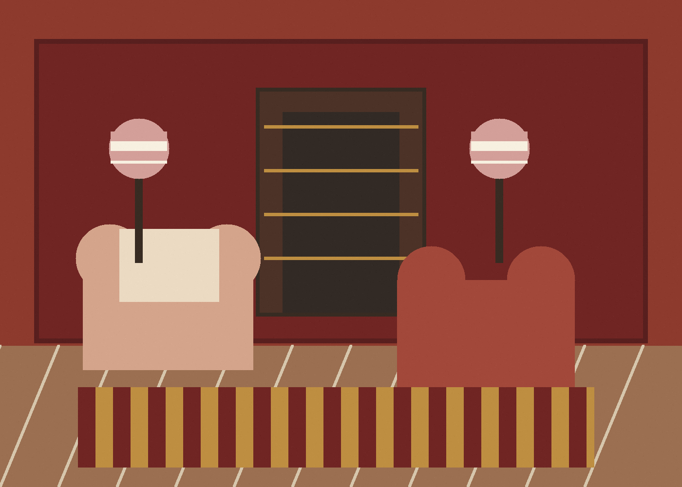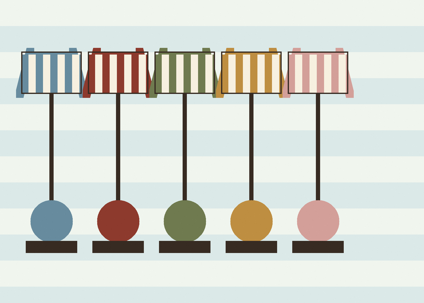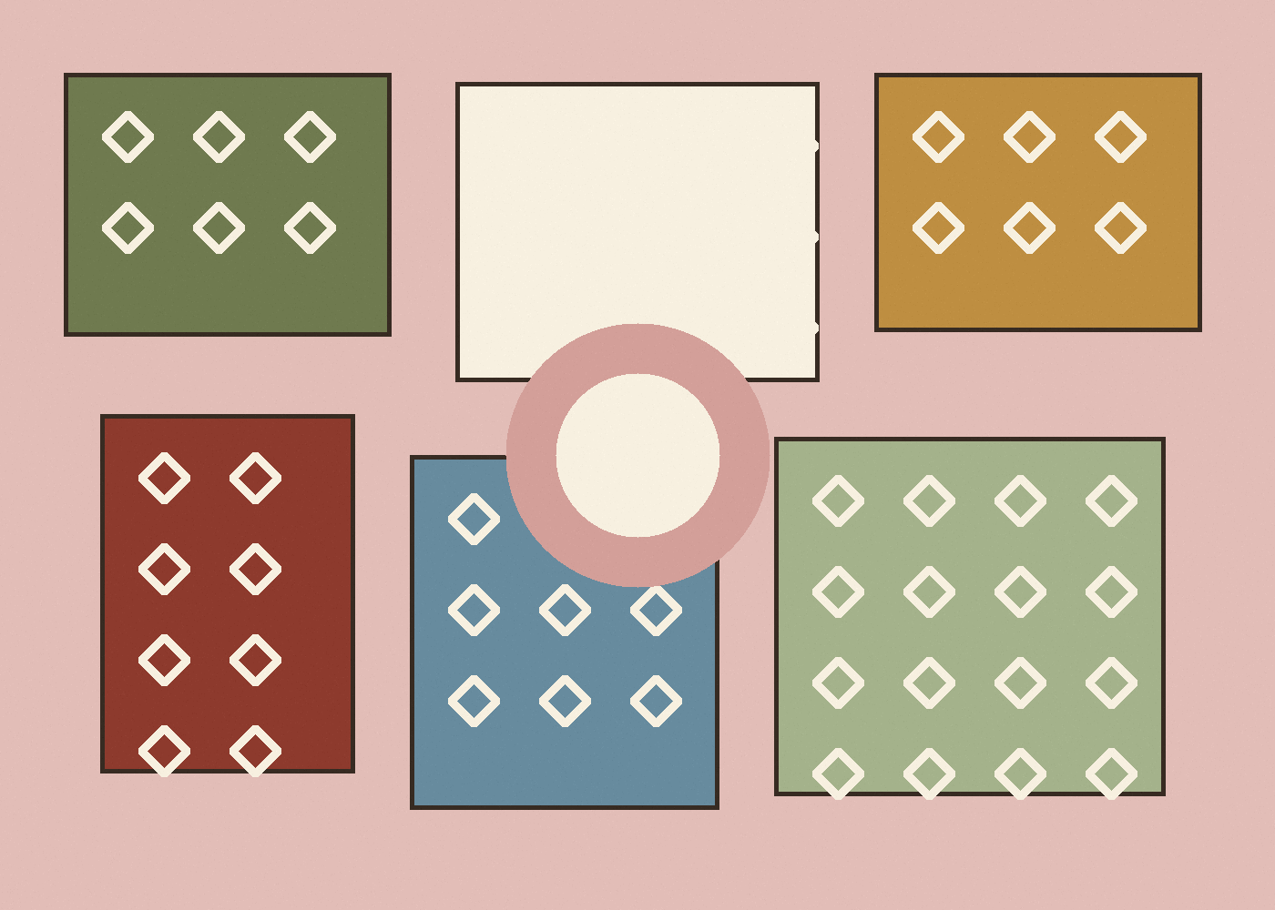
Olive, rose and ochre work because none of the three colours is too clean. They all have age in them. Olive gives weight, rose softens the edge, ochre brings light and a small amount of tension.
The palette is useful for decorative rooms because it speaks to material: painted furniture, old plaster, rush, brass, faded textiles and timber.
The combination works when the colours feel aged, not sugary.
Detail to practical use
- Detail: olive, rose and ochre used as a softened palette.
- Design effect: warmth, weight and light without a clean modern contrast.
- Context: old plaster, brass, timber, rush, faded textiles and painted furniture.
- Practical use: let one colour lead and use the others as echoes.
What to notice
- Olive acts as the anchor; it keeps rose from becoming too soft-edged.
- Ochre works best as a smaller signal: trim, lampshade, border, book spine or painted line.
- The palette becomes richer when one colour appears in pattern rather than as a flat block.
The detail that matters
Do not divide the palette evenly. Let one colour carry the room and use the others as echoes. Olive walls with a rose textile and ochre shade. Rose curtains with an olive table and a darker red note. Ochre ground paper with green-painted woodwork.
This is the sort of observation that can begin as an Instagram save and become a fuller reference note on the site.
Credits and links
- Main image: Studio Elwick visual study.