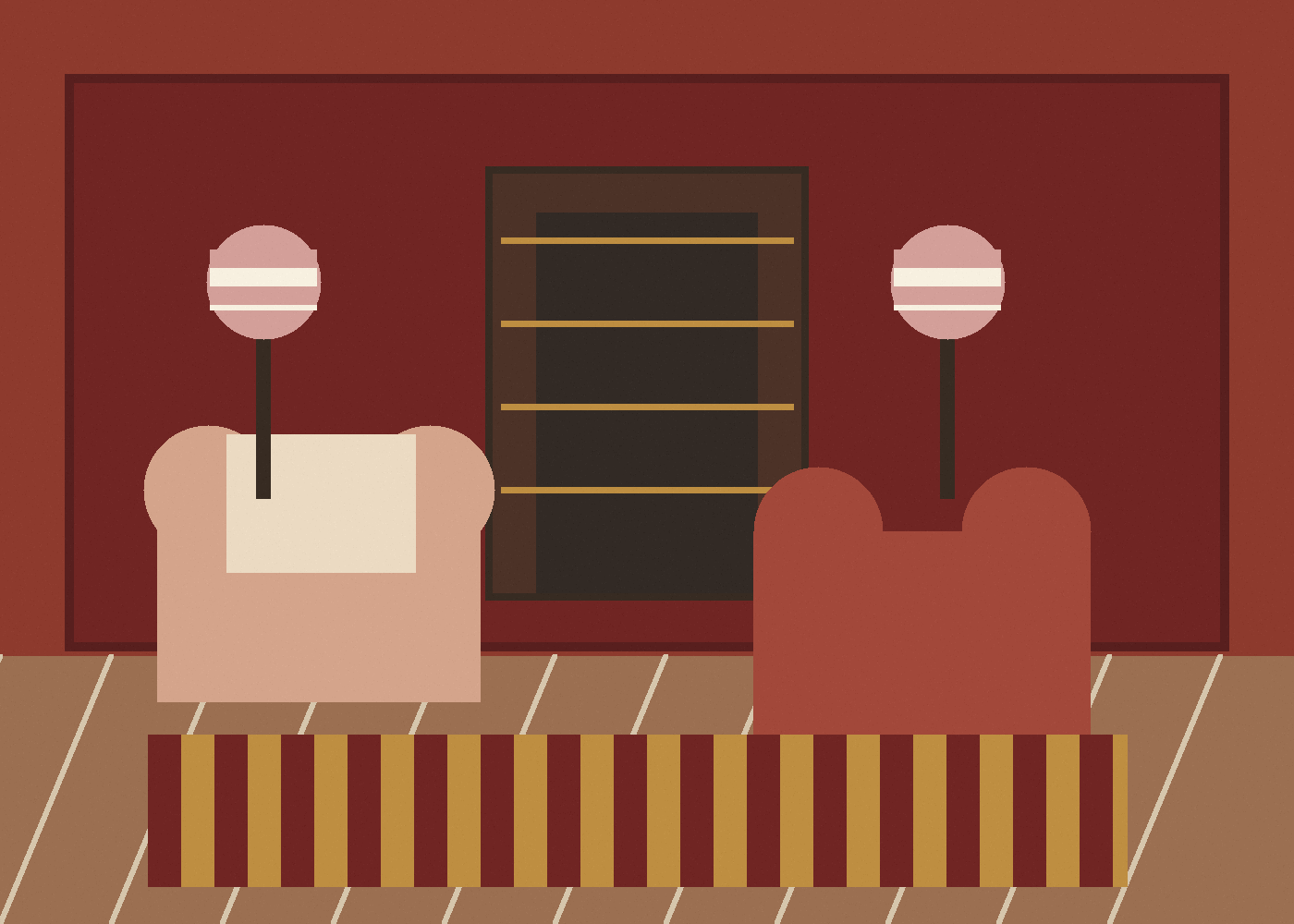
Rust red is often treated as a dramatic colour, but the useful version is quieter than that. It has brown, brick, leather or terracotta in it, which allows it to sit beside old timber, brass, books, rush, ceramic blue and textiles that have already softened with age.
That muddiness is the point. A clean red can dominate. A rust red gives the room a centre of gravity and makes other materials look more deliberate.
Detail to practical use
- Detail: red with brown, brick, leather or terracotta in it.
- Design effect: a centre of gravity for timber, textiles, lamplight and books.
- Context: antique surfaces, aged materials and colours that have already softened.
- Practical use: repeat it in small useful objects rather than as a loose accent.
What to notice
- The red has warmth and brown in it, so it relates to timber, leather and brick.
- It works especially well when repeated in small ways: a trim, lampshade, ottoman or rug border.
- Olive, ochre, plaster pink and dusty blue keep it from feeling flat or themed.
The detail that matters
Rust red is strongest when it is attached to a useful object or architectural surface: a painted cabinet, the inside of a cupboard, a lampshade, a chair stripe, a border. It should feel built into the room rather than applied as a seasonal accent.
A useful way to judge the colour is to ask what it is doing, what it sits with, and whether the room would feel less grounded without it.
Credits and links
- Main image: Studio Elwick visual study.